Visual Identity for Margot Molyneux, a Cape Town based fashion label with a focus on sophisticated minimalism.
The label was sunsetted in 2020
Description
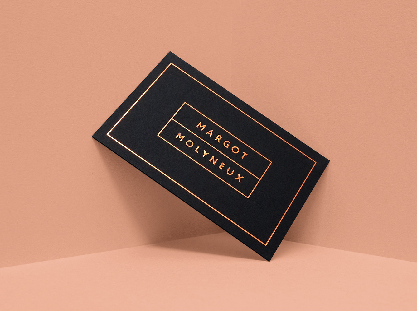
In 2016 I started working with Margot to design an entirely new branding concept for the label. We wanted to create something that would match the simple sophistication and quality of the clothing, while providing a subdued, contemporary and elegant visual language for the brand.
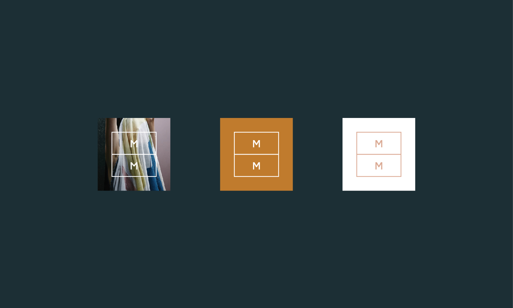
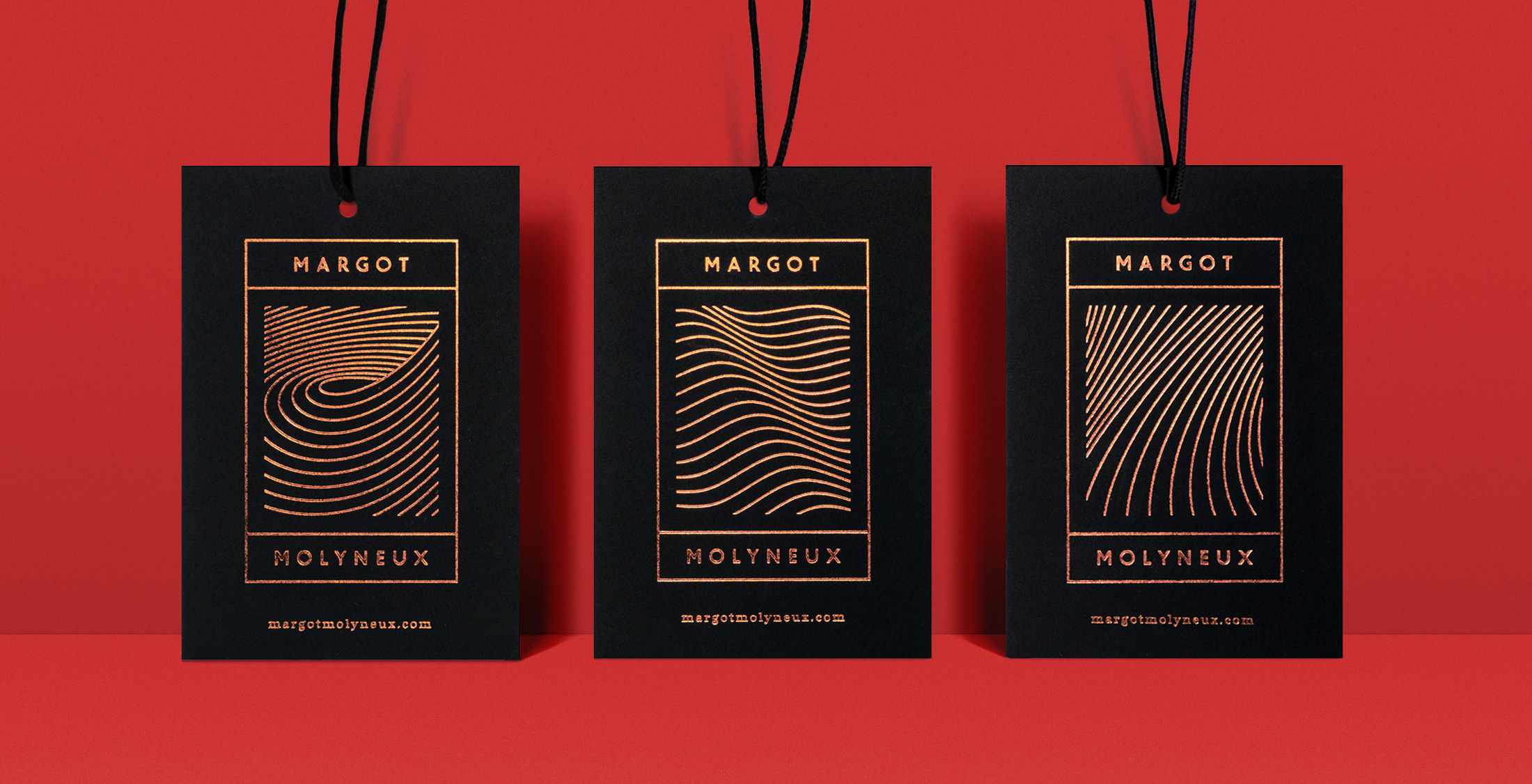
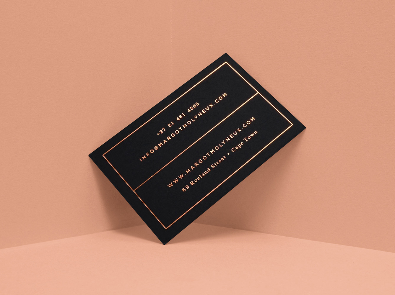
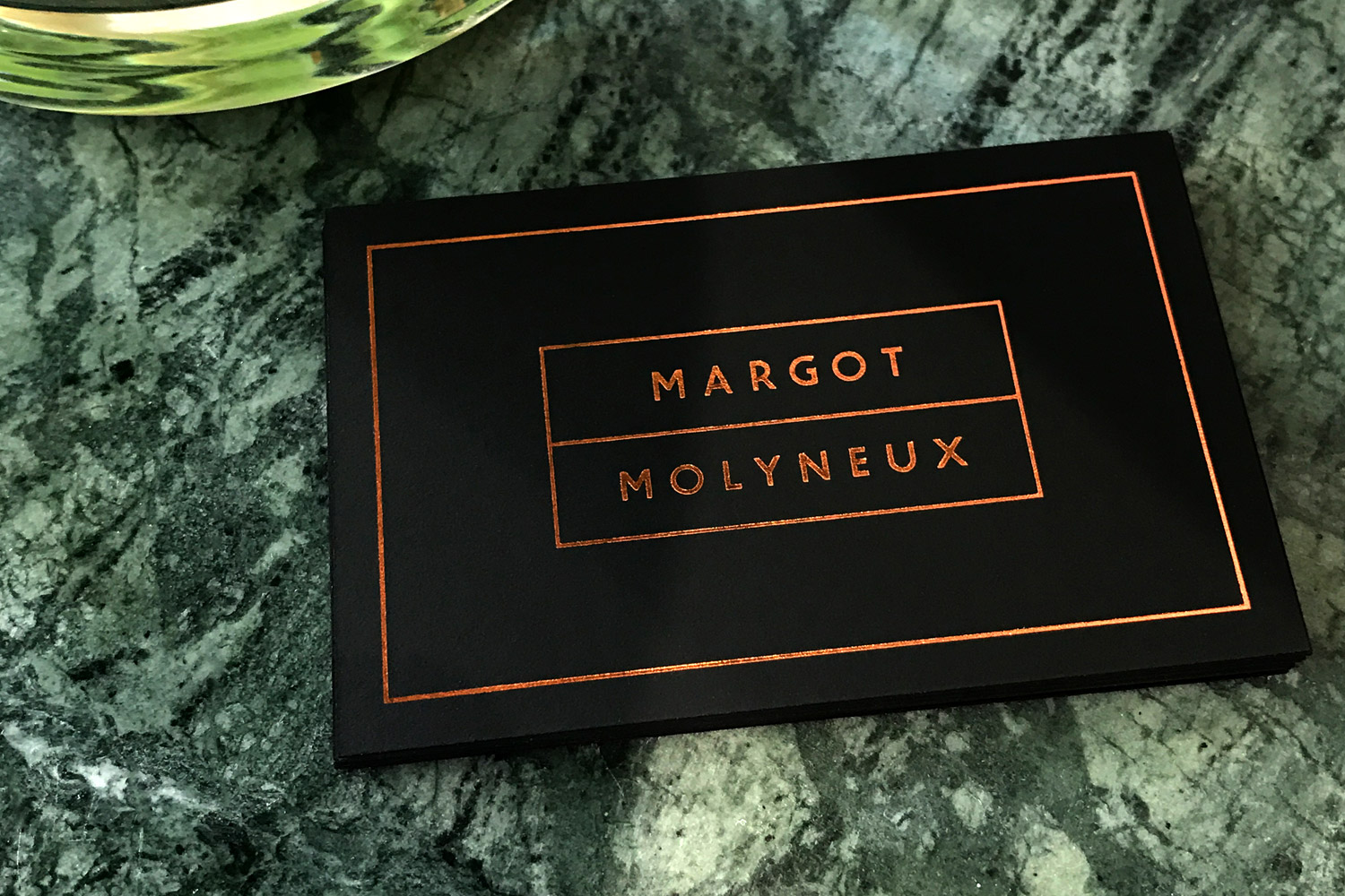
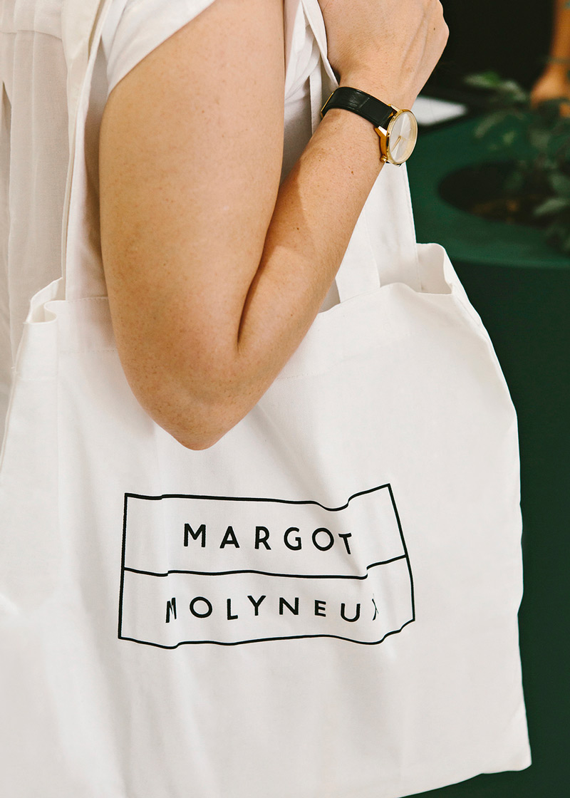
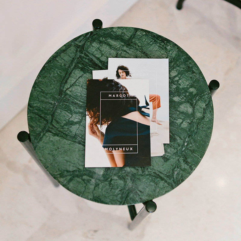
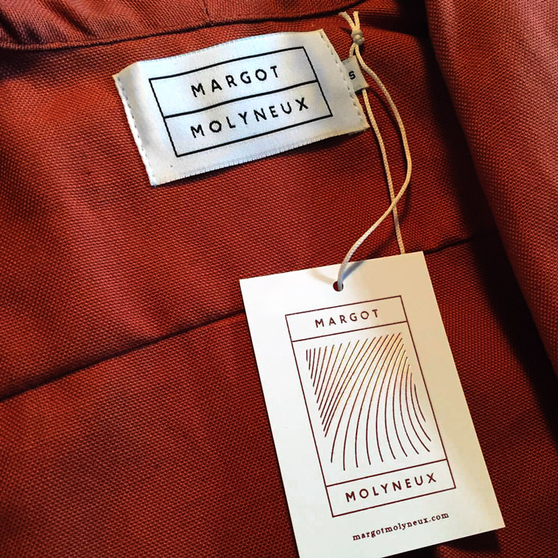
The modual, flexible brand mark acts as a frame to house everything from thematic illustrations on the swing tags, to providing a branding overlay for look-book photography.
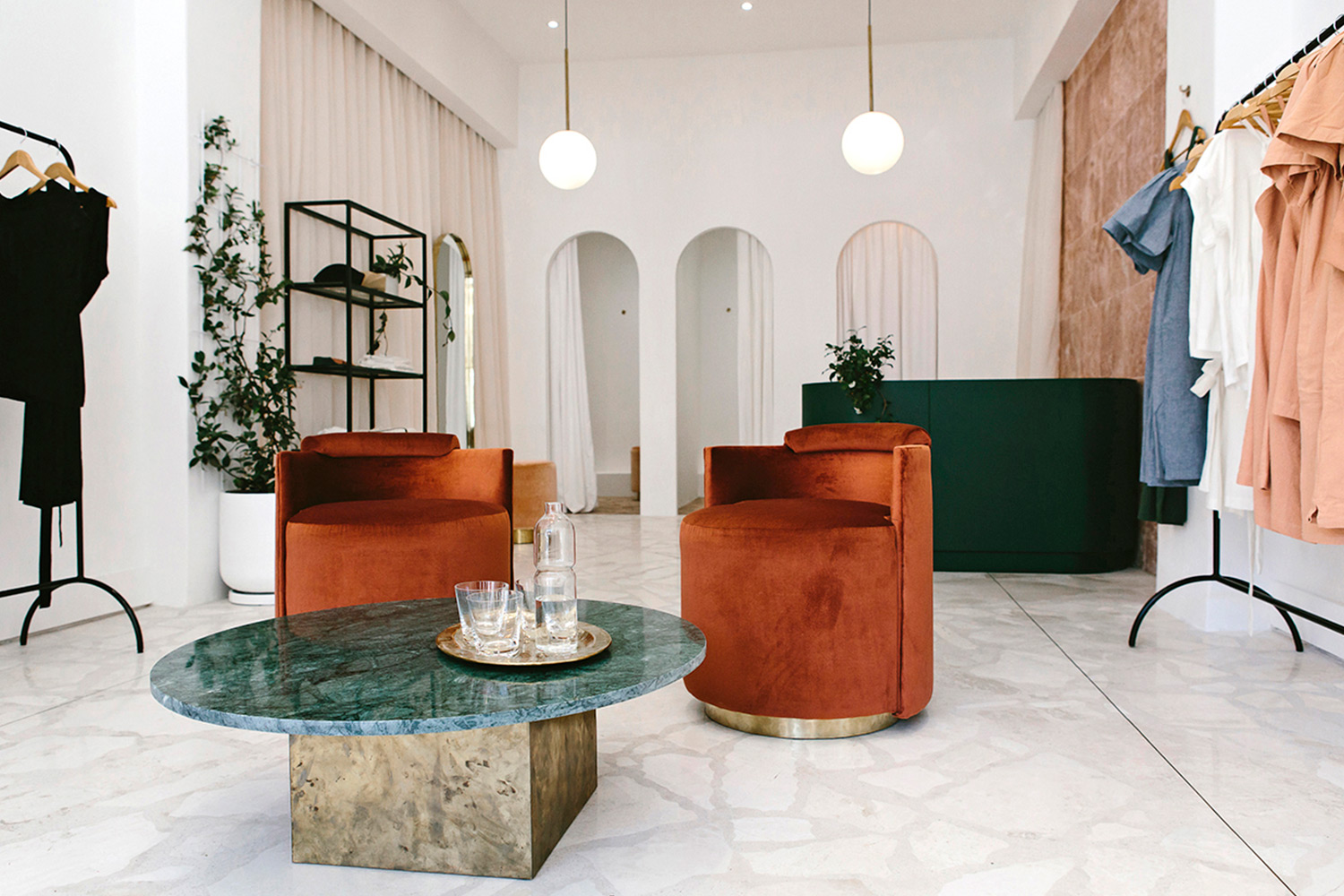
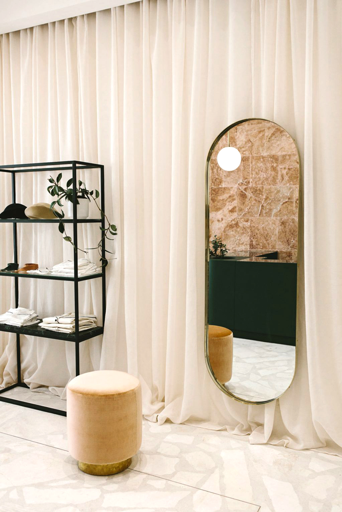
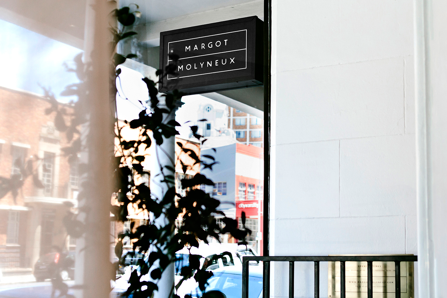
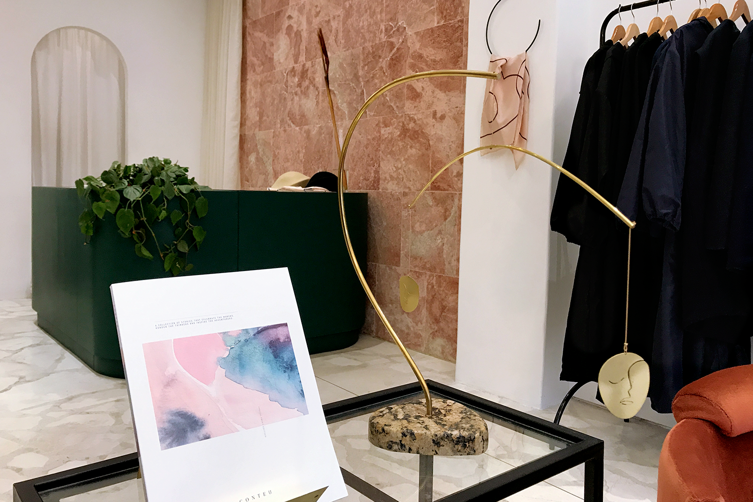
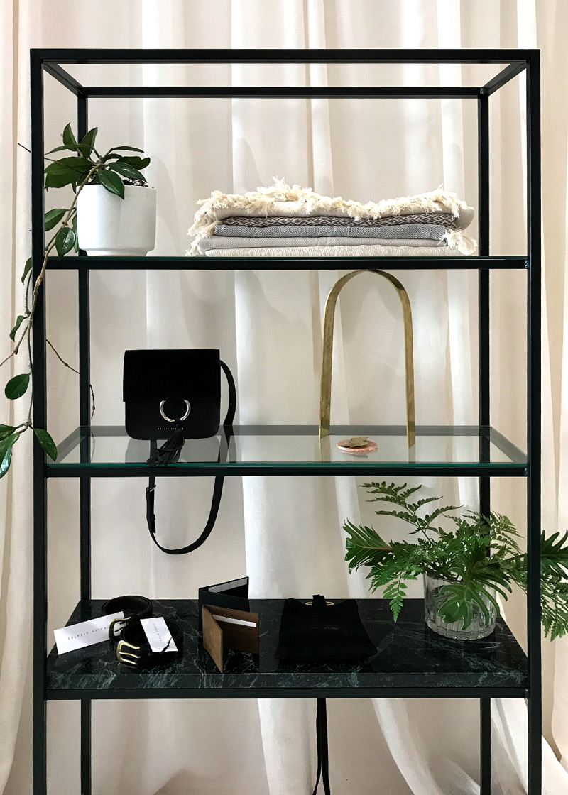
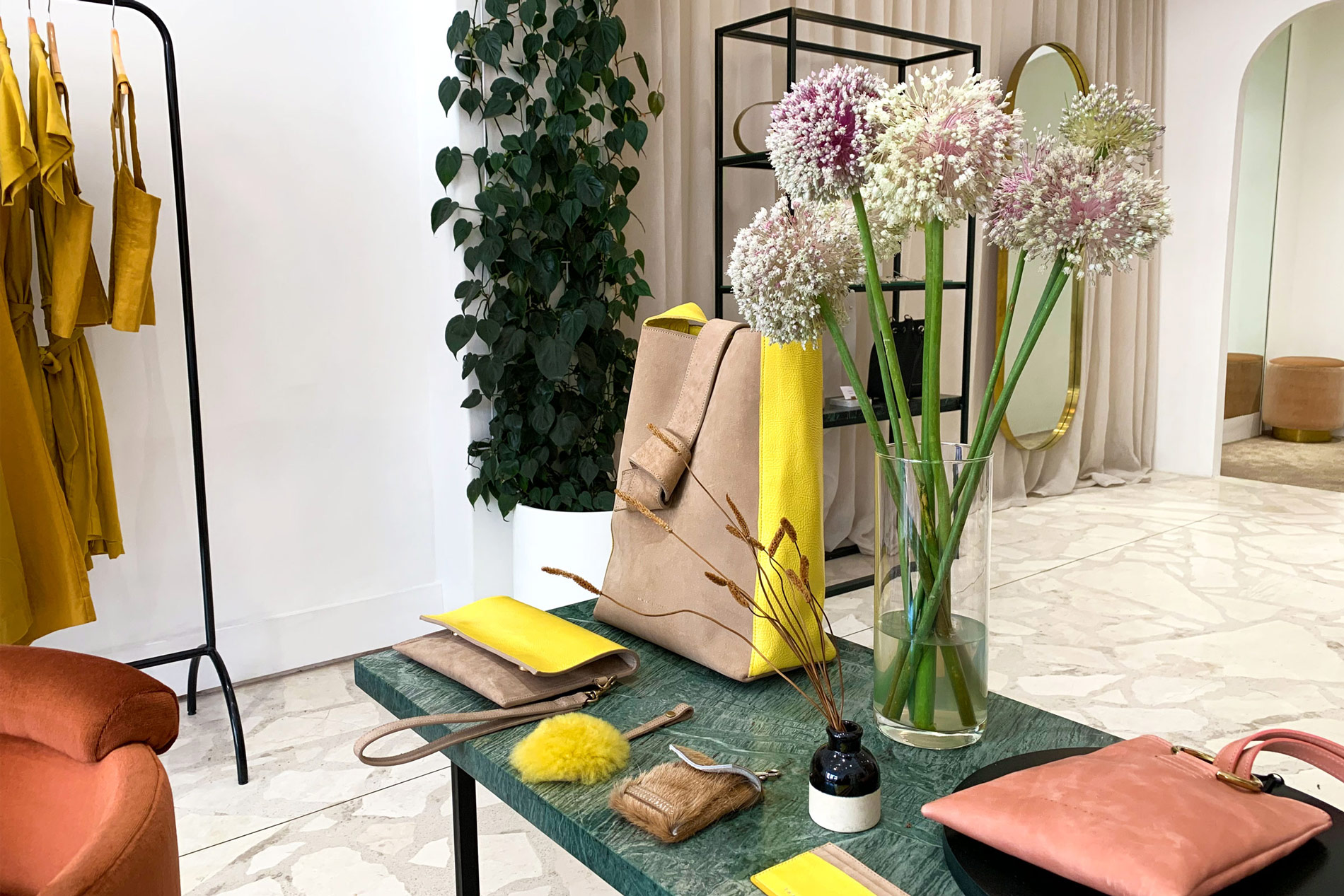
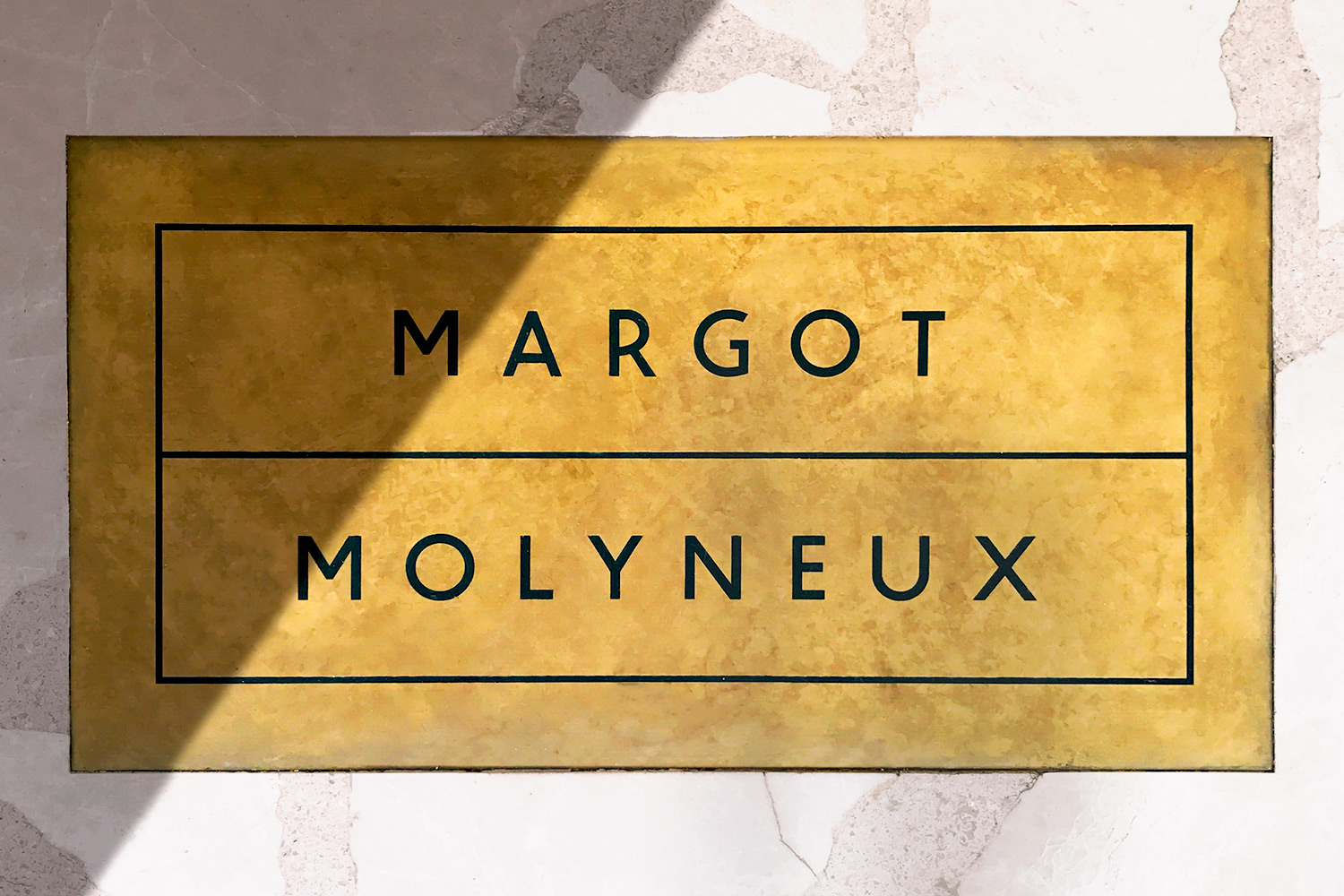
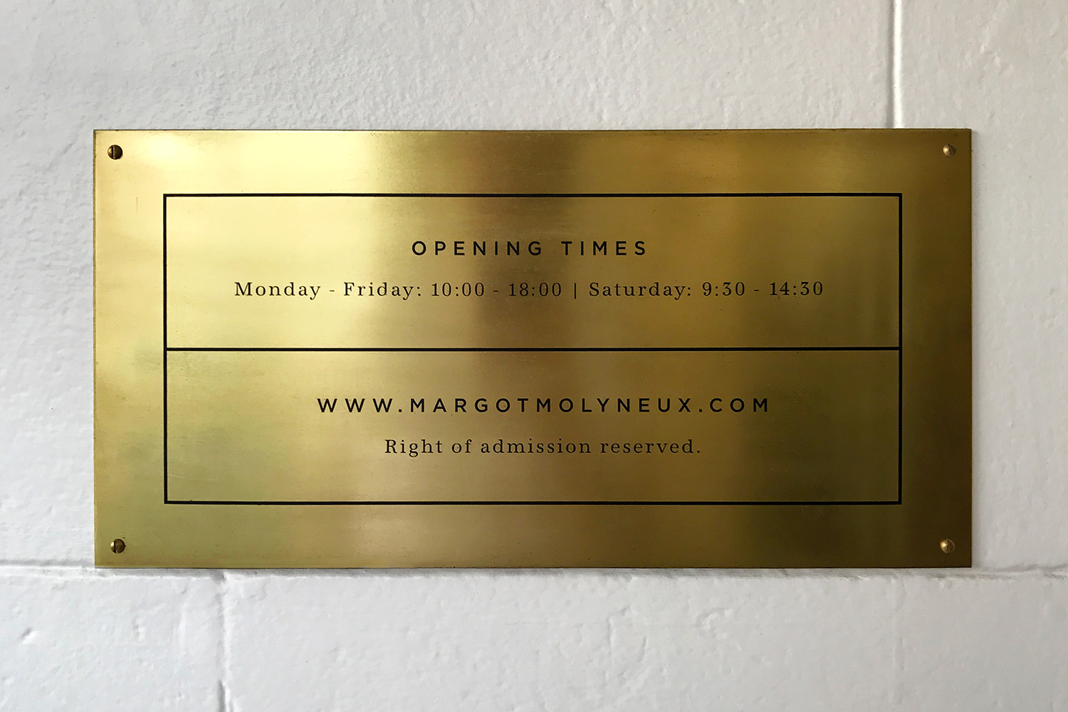
I also worked with her and her interior designer on her first brick and mortar loacation to ensure parity and coherence with the graphic language of the brand.
The modual, flexible brand mark acts as a frame to house everything from thematic illustrations on the swing tags, to providing a branding overlay for look-book photography.
I also worked with her and her interior designer on her first brick and mortar loacation to ensure parity and coherence with the graphic language of the brand.
Services
Brand Concept • Strategy • Identity Design • Signage • Art Direction • Interior Consulation
Credits
Interior Design: Marlon Leggat
Product Photography courtesy of client
Product Photography courtesy of client
Brand Photography: Jordan Metcalf, Ryan Bush