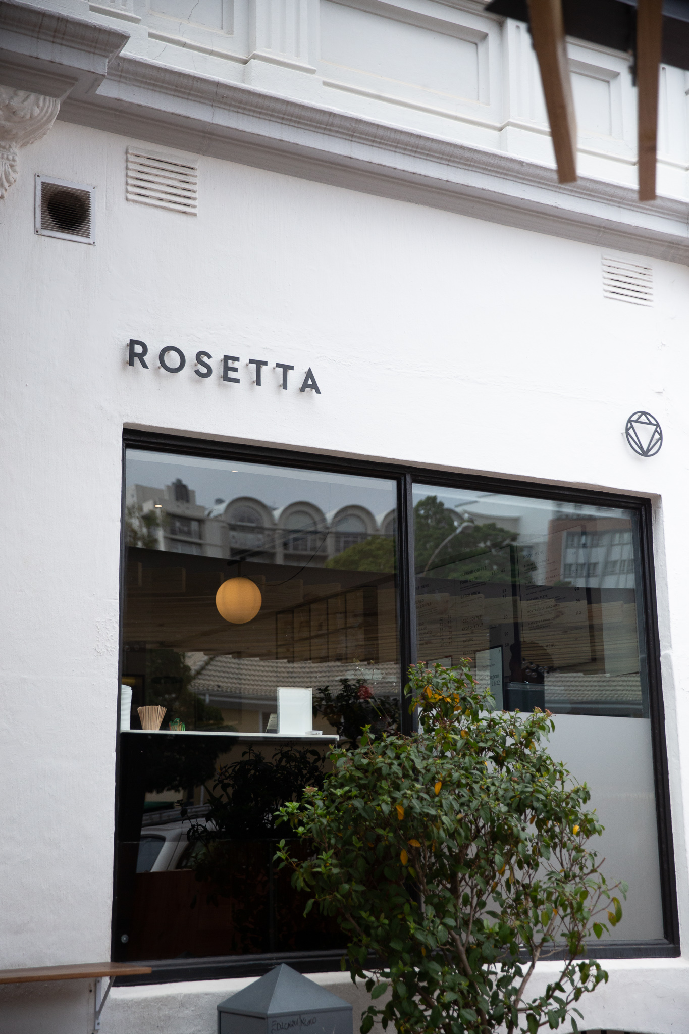
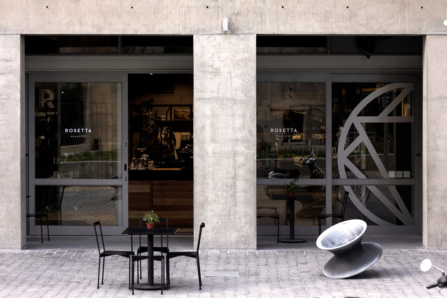
Visual Identity for Rosetta, a multi award-winning roastery pioneering modern coffee in Cape Town, South Africa.
Created in partnership with Adam Hill
rosettaroastery.com →
Description
Since their conception in 2010, Rosetta has been a defining force in the South African coffee industry, continually setting the standard of quality and thoughfullness for the local bugeoning speciality coffee scene.
I have worked with them since the beginning—along with fellow designer Adam Hill—to create branding solutions that range from intial strategy, identity design and packaging to interior design direction and consulting.
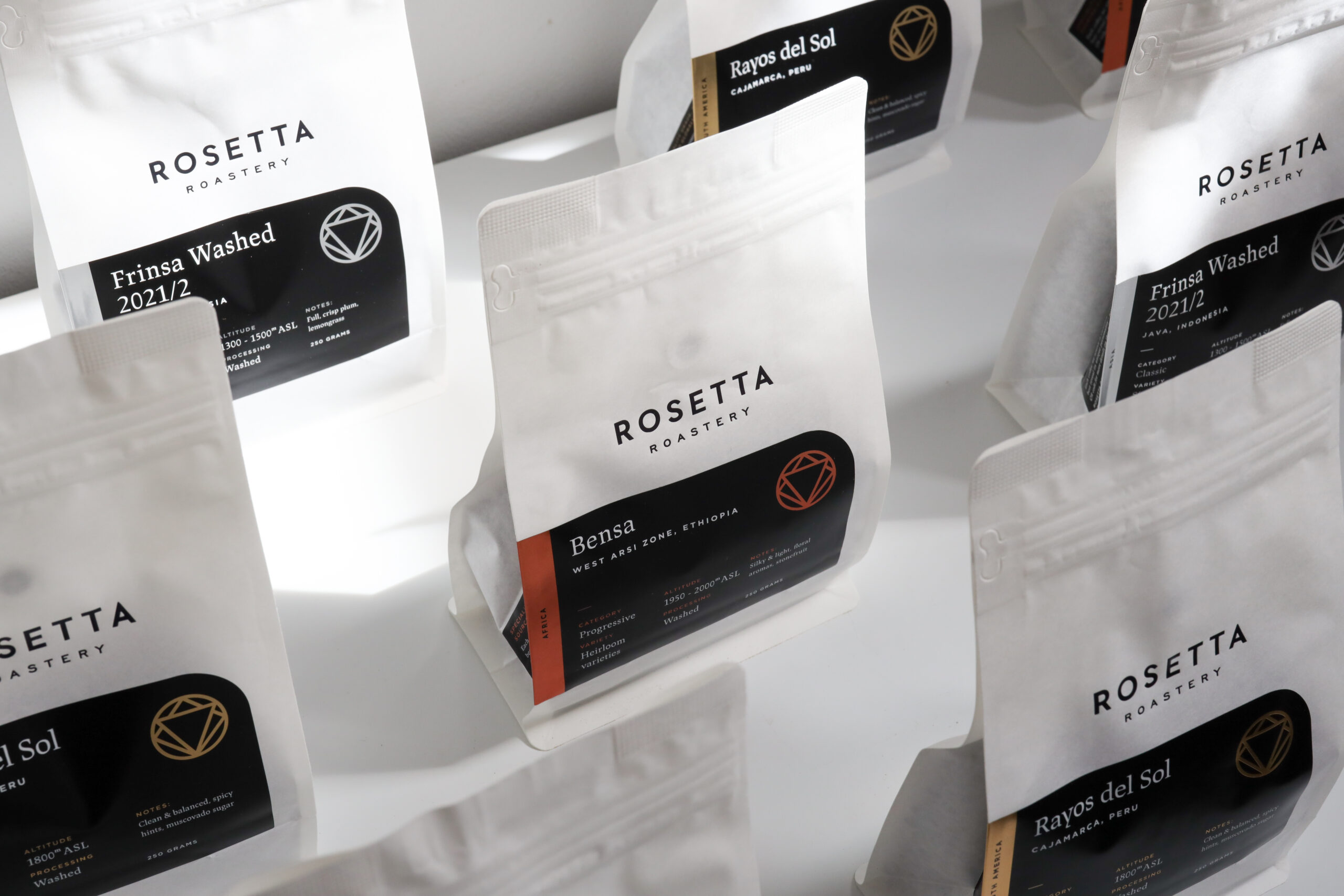
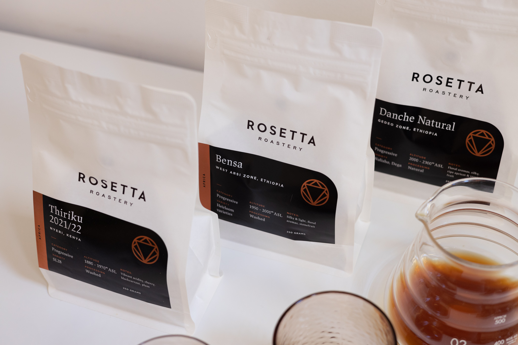
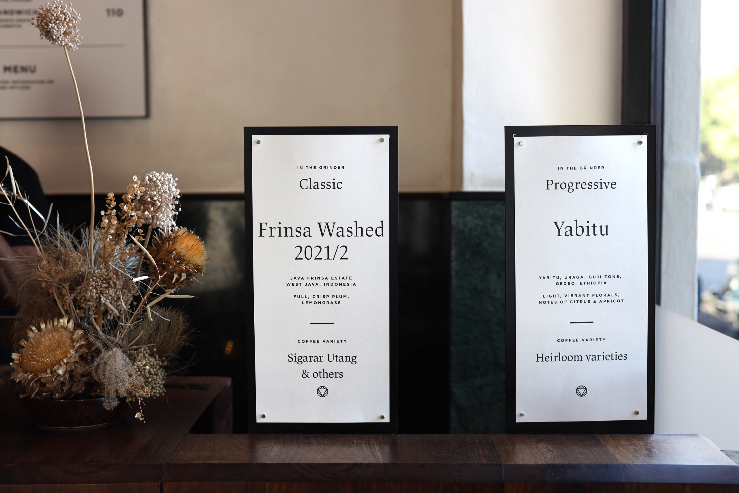
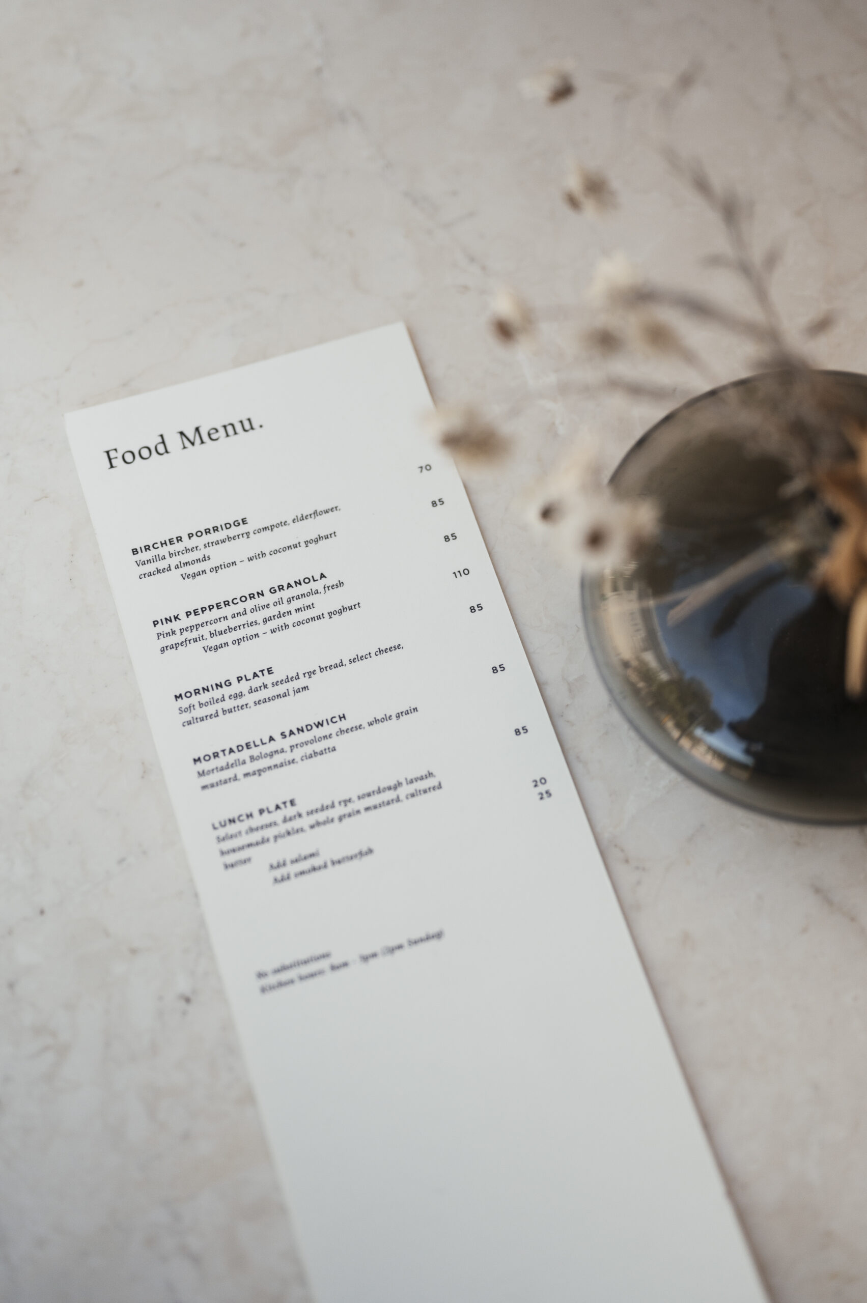
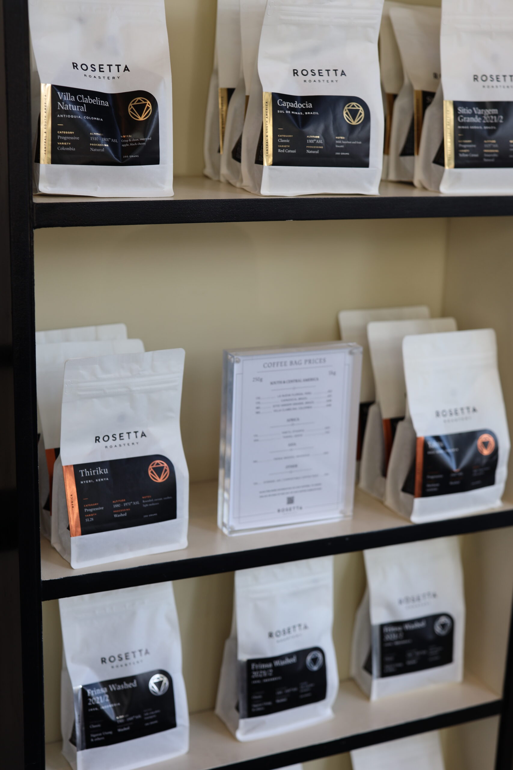
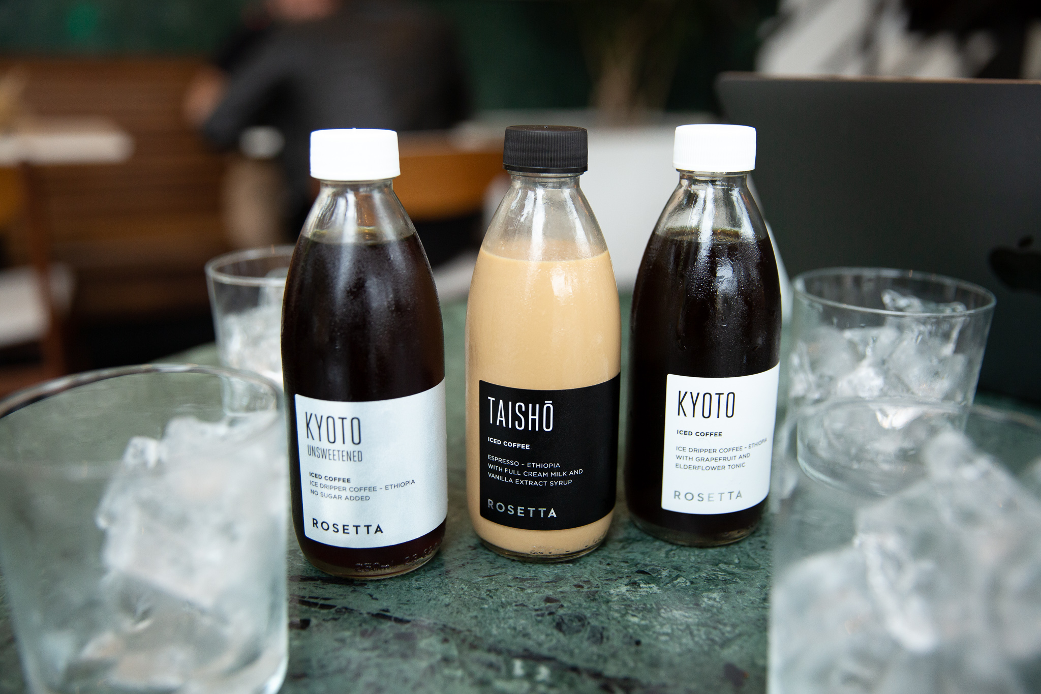
The visual identity centers around the identifcation and celebration of the 3 primary regions they source from—Africa, Central & South America, and Asia—associating a specific shape and colour to each region to create easy identification for the broad flavour profiles and characteristics present in each.
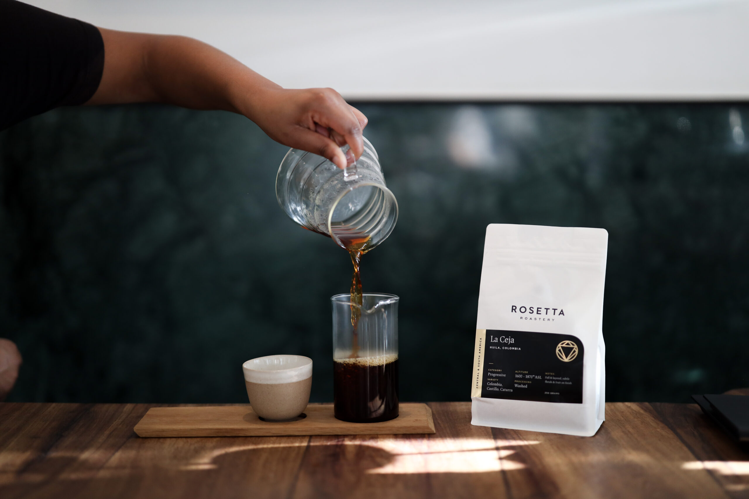
The brand has gone through a progressive evolution over time, as consumers have become more knowledgeable about coffee, allowing the brand to take a more subtle posture from the intital information and education forward approach. However we still continue to center and celebrate the geography, growers, and tasting notes of each single origin roast.
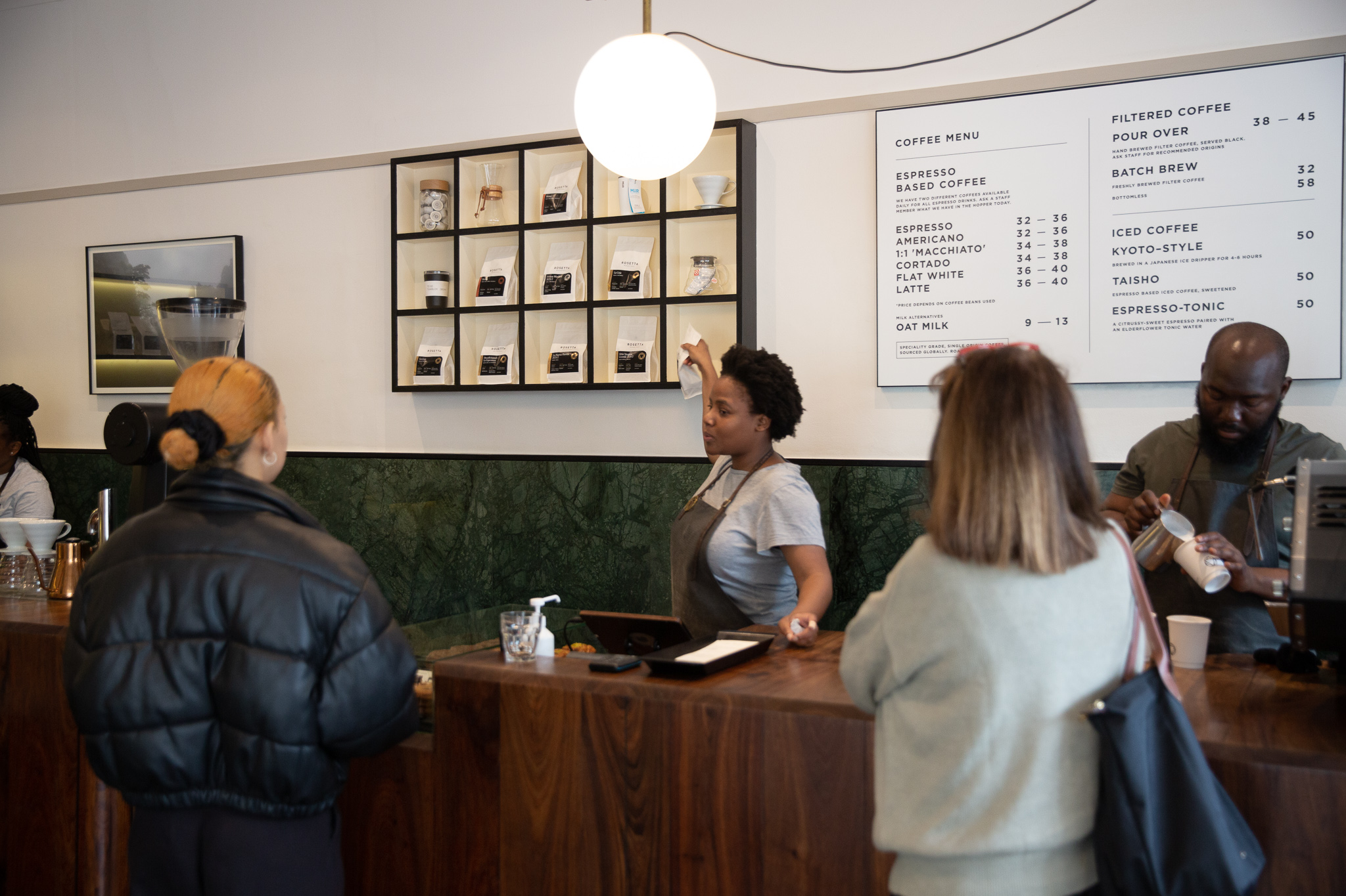
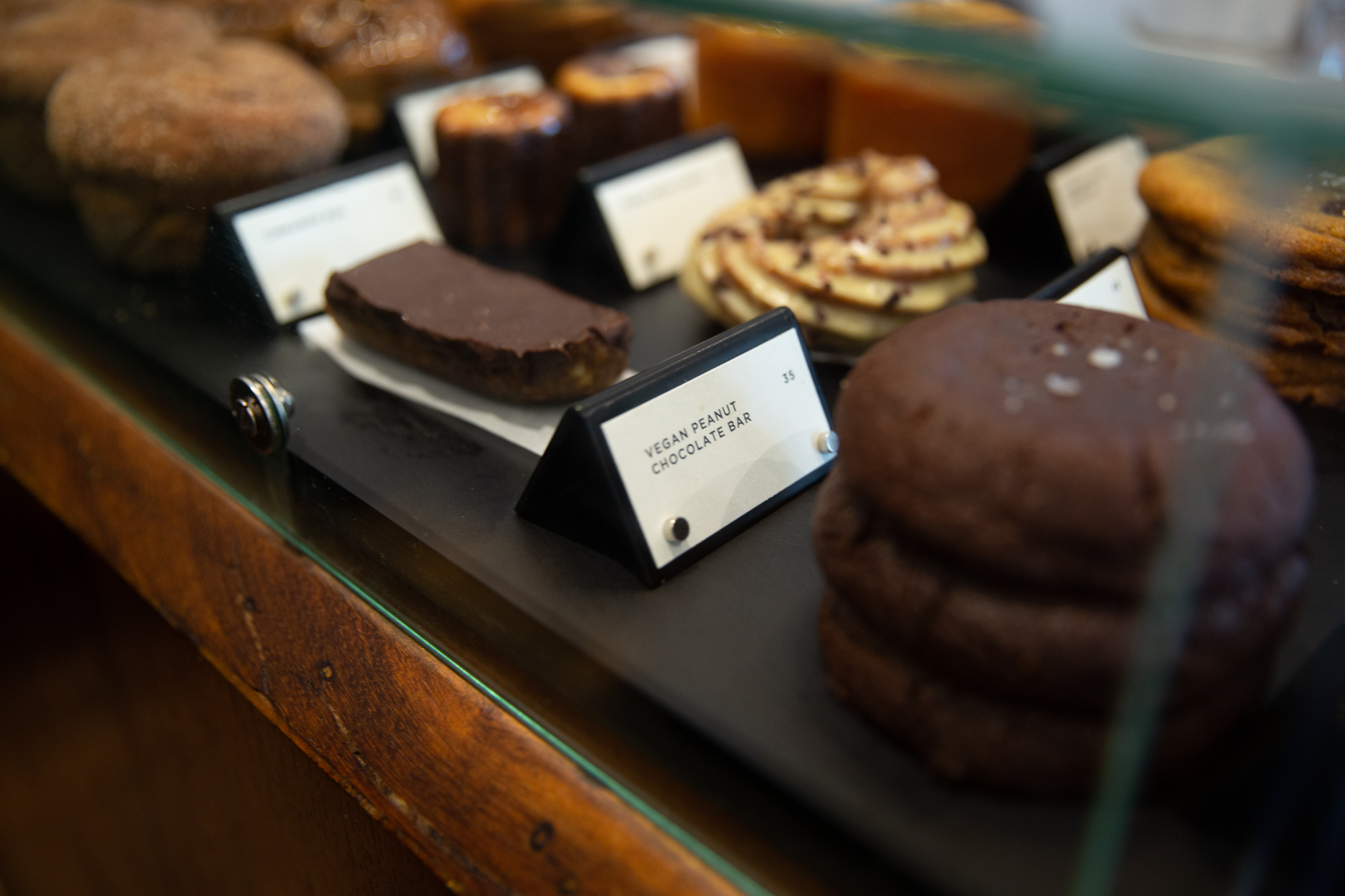
Beyond the graphic design, we have worked with the team and their other creative partners to ensure coherency and brand architecture in custom made functional objects, furniture, event collateral, and spaces.
I have worked with them since the beginning—along with fellow designer Adam Hill—to create branding solutions that range from intial strategy, identity design and packaging to interior design direction and consulting.
The visual identity centers around the identifcation and celebration of the 3 primary regions they source from—Africa, Central & South America, and Asia—associating a specific shape and colour to each region to create easy identification for the broad flavour profiles and characteristics present in each.
The brand has gone through a progressive evolution over time, as consumers have become more knowledgeable about coffee, allowing the brand to take a more subtle posture from the intital information and education forward approach. However we still continue to center and celebrate the geography, growers, and tasting notes of each single origin roast.
Beyond the graphic design, we have worked with the team and their other creative partners to ensure coherency and brand architecture in custom made functional objects, furniture, event collateral, and spaces.
Services
Strategy + Foundation • Identity Design • Packaging • Signage • Art Direction
Credits
Designed in partnership with Adam Hill
Interior Design: Marlon Leggat
Photography courtesy of client
Interior Design: Marlon Leggat
Photography courtesy of client
All content © 2023 Jordan Metcalf Studio. Good ☻ Grief.
© 2023 Jordan Metcalf Studio. Good ◑ Grief.
© 2023 Jordan Metcalf Studio. Good ◑ Grief.